Data manipulation and visualisation in R
In the last tutorial, we got to grips with the basics of R. Hopefully after completing the basic introduction, you feel more comfortable with the key concepts of R. Don’t worry if you feel like you haven’t understood everything - this is common and perfectly normal! Learning R is very much like learning a real language in that it takes time and practice to feel ‘fluent’. Even if you do feel comfortable in the language, there is no shame in asking for help or looking for more information to develop your understanding. As regular R users, we still look things up constantly and there are one or two basics which we still forget, even with over a decade of experience of using the R environemnt! With this in mind, a goal of these R tutorials is to re-emphasise and reinforce basic concepts throughtout. We will introduce concepts but through the practical demonstrations of code, we will underline them again and again.
Here we remain solely in the R environment and will instead switch our focus to more advanced features of R. Advanced does not necessarily mean more complicated - but it does mean that you need to have at least been introduced to the basic concepts. We will first ‘level-up’ our approach to handling and manipulating data. For this, we will be borrowing heavily from the tidyverse - a collection of packages and principles for data science in R. We will also introduce you to more advanced plotting, comparing the two most popular apporaches for plots - base and ggplot.
We will also use this tutorial to introduce some important features of programming. We show you the benefits of using an R script to keep track of your code and to reproduce your analysis. This will form the basis of how we will approach R programming in future sessions. In particular, it will be important for when we learn how to write our own functions and basic programming code throughout the week.
What to expect
In this section we are going to:
- explore more advanced methods of handling and manipulating data
- learn how to plot data using
ggplot2 - introduce the benefits of writing R scripts
More advanced manipulating and handling data
Data manipulation might seem quite a boring topic but it is actually a crucial part of data science and increasingly, bioinformatics and evolutionary biology. For the average researcher working with biological data, we would estimate that the vast majority of analysis time is spent handling the data. By handling and manipulation, we mean exploring the data, shaping it into a form we want to work with and extracting information we find important or interesting. Getting to know your data is absolutely fundamental to properly understanding it and that is why we have decided to dedicate time to it in this tutorial.
At this point in our tutorial, we will use a series of packages collectively known as the tidyverse; in particularly, we will focus on functions from a tidyverse package calleed dplyr. These packages grew from the approach of Hadley Wickham - a statistician responsible for popularising fresh approaches to R and data science. As with nearly all things in R, there are many, many ways to achieve the same goal and the guidlines we give here are by no means definitive. However, we choose to introduce these principles now because in our experience of data analysis, they have greatly improved our efficiency, the clarity of our R code and the way we work with data.
Having used R for sometime, we have come to the tidyverse approach having already learned many of the basics in ‘normal’ or so-called ‘baseR’. It can be difficult to shake off what you have already learned! This is one of the reasons we are keen to introduce you to these approaches early on - they will be much easier for you to take on board if you are less familiar with the ‘standard’ way of doing things. A brief note on approaches - there is a surprising amount of snobbery and elitism for approaches to coding and scripting - this is true for R and other programming languages. We wish to steer well clear of this, the most important thing is learning how to use the tools at your disposal effectively and efficiently.
Getting started with tidyverse packages
To go further, the very first thing we need to do is install and load the tidyverse package. Luckily, this is very straightforward! Run the following commands.
install.packages("tidyverse")
library(tidyverse)
As mentioned before, we will focus mainly on the dplyr package here - occassionally we might use some other packages and if we do, it will be stated clearly. The next thing we need to do, is get some data to work with. We will use the starwars data from dplyr - you may be noticing a theme here…
starwars <- dplyr::starwars
What did we do here? We assigned the starwars dataset - specifying it was frome dplyr using the :: - that basically means, ‘look inside dplyr for starwars’
If you take a look at the data by typing starwars, you will see it is stored as a tibble. This is a convenient way of displaying a data.frame and for all intents and purposes, behaves much the same way. It has the added advantage that it just shows you the first 10 lines of the data (known as the head). It also shows you what the data actually is - i.e. whether it is character data, integer, double or a factor. The tibble still behaves exactly as a it would as a standard data.frame. For example…
starwars$name
…will produce a vector with the names of all the characters. Since the tibble only shows you the first 10 rows of your data, what if you want to see more? For that you can use the print function, like so:
print(starwars, n = 15)
So now we have the package loaded and the data ready - we can start playing around with it!
Selecting columns
Lets say we want to choose the name and homeworld columns from our starwars data, how can we do that? With standard R, we might do something like this.
# with names
starwars[, c('name', 'homeworld')]
# with indices
starwars[, c(1, 9)]
With dplyr we can do the following:
starwars %>% select(name, homeworld)
Wait a minute, what does %>% do!? This is a pipe - it essentially means, take the thing on the left and apply the function on the right to it. You can use it create chains of functions which you can easily apply to multiple data.frames if you need. It takes a bit of getting used to, but it can often clarify code. For consitency with standard R, we could have also written the code above like so:
select(starwars, name, homeworld)
Both ways work and ultimately that is all that matters but for clarity and good practice, we will use the %>% pipe to make up our data handling workflows. So what else is going on with these two tidyverse inspired function calls? Well the function select, literally chooses columns from our data.frame. Hopefully the straightforwardness of this approach is a demonstration of how these packages can make R code more readable and easier to understand.
select is more powerful than just this. See some examples below:
# choose all columns BUT name
starwars %>% select(-name)
# choose only columns containing an underscore
starwars %>% select(contains("_"))
# choose only columns beginning with "s"
starwars %>% select(starts_with("s"))
Filtering data
We’ve seen now how to select columns using a dplyr approach - but what if we want to select rows? To do this, we need to filter the data on a given criteria. Let’s say we want to just select humans from our starwars data. We can achieve this using a logical approach - i.e. extracting only rows which match our criteria - i.e. whether the individual is human in this case. Let’s first see what happens when we apply a logical operation to the species column. Remember that for now, we will just use baseR.
starwars$species == "Human"
All we did here is ask whether the species data is equal to the string ‘Human’. This returned a logical vector of TRUE and FALSE values. If we now use this to subset our data.frame, R will only return rows where the value is TRUE. For example:
starwars[starwars$species == "Human", ]
Note that you have to specify you mean species within the starwars data using a $ operator, because otherwise R doesn’t know where to look. In other words, the following will not work:
starwars[species == "Human", ]
You should also note that we need a == instead of a = - this just means ‘is equal to’. So what is the dplyr alternative? We can use the straightforwardly names filter function for this:
starwars %>% filter(species == "Human")
Notice we use the %>% pipe again - the reason for this will hopefully become clear soon! You might be wondering at this point, that there doesn’t seem to be a huge difference between these two approaches, other than the way the code looks. Where the filter command really becomes useful is when you use it for multiple different variables.
Let’s suppose we want to extract all individuals that are Human and that are from Tatooine as their homeworld. With baseR, we would do the following:
starwars[which(starwars$species == "Human" & starwars$homeworld == "Tatooine"), ]
Note that here, all which does is make sure we subset the data.frame properly. What about with dplyr? Well this would work:
starwars %>% filter(species == "Human", homeworld == "Tatooine")
You can see how dplyr makes filtering on multiple variables much more straightforward and cleaner.
Filtering AND selecting data
What if you want to do multiple things to a dataset at once? Perhaps you need to get your data into a certain format or just want to subset it to only the variables you are interested in. As you get more and more experienced with R, you will find this is something you want to do regularly. It makes sense to manage your data, stripping it down to the key values of interest. This is part of the principle of tidy data.
Let’s return to our starwars dataset - what if we want to get the name, height and year of birth for all human species? If we use baseR, we would do it this way:
starwars[starwars$species == "Human", c("name", "height", "birth_year")]
This sort of data manipulation requires us to first filter on the rows using starwars$species == "Human". Remember previously, when we used square brackets to extract data from a matrix and then a data.frame? This is exactly the same thing.
Next, we select the columns we want in the second part of the brackets using c("name", "height", "birth_year"). This is fairly straightforward, even using baseR but you can imagine how this could be complicated if we wanted to select many different columns or filter on different variables.
What is the dplyr solution?
starwars %>% filter(species == "Human") %>% select(name, height, birth_year)
Here we just pipe the data to filter and then again to select. It is worth noting here that the tidyverse solution might not be particularly faster or even much less code. It is (in our opinion at least) easier to read and to disentangle, if you come back to the code at a later date. There really is no right or wrong way to manipulate data in R - whichever approach you use is ultimately a matter of taste. However as you will see in the next section, dplyr approaches can really level up your ability to manipulate data.
Summarising data
Where dplyr really excels is when you want to extract some kind of summary information from your data. Let’s start with a very straightforward example using our starwars data. What if we want to count the number of different species there are in the data? First, let’s actually look at the species present.
starwars$species
You can see there are few different ones, although even from this it is fairly obvious humans are going to be the most numerous. If we want to count how many species there are, all we need to do is count the occurrence of each of these. Before we look at the dplyr solution, we will take a look at one more baseR way to achieve this.
table(starwars$species)
This works and is fast but the main disadvantage is that our output is no longer a data.frame. It is also much more difficult to scale this approach up if we wish to group our dataset by multiple variables. But first, the dplyr equivalent of above is also straightforward:
starwars %>% group_by(species) %>% tally()
All we have done here is first grouped our dataset by species using group_by and then counted the number of rows in each group using tally.
group_by can really come into its own when you want to count or tally data based on several variables. Let’s say we want to count the number of each gender of within each species. We would do it like so.
starwars %>% group_by(species, gender) %>% tally()
We can do a lot more than just count occurrences with this functionality from dplyr. Perhaps we want to know the average height and mass of each species?
starwars %>% group_by(species) %>% summarise(mean_height = mean(height, na.rm = T),
                                             mean_mass = mean(mass, na.rm = T))
Here all we did was use the summarise function to calculate mean height and mass. Since we used the mean function on both variables, we can actually simplify this even further like so:
starwars %>% group_by(species) %>% summarise_at(vars(height, mass), mean, na.rm = T)
So this time we used summarise_at and specified the variables we wanted to summarise with the vars function.
Summarising data in this way is a useful skill, especially when you want to get a feel for what your dataset shows or you need to break it down into more understandable subsets. As we turn next to more advanced plotting using ggplot2, you will see that manipulating data is especially useful when you want create certain types of plots.
Plotting with ggplot2
In the last session, we learned that R is highly versatile when it comes to plotting and visualising data. Visualistation really cannot be understated - as datasets become larger and more difficult to handle, it is imperative you learn how to effectively plot and explore your data. This obviously takes practice, but plotting and summarising data visually is a key skill for guiding further analysis - this is especially true for evolutionary genomics but is easily applicable to any number of scientific fields.
As you may have gathered by now, there are lots of opinions on how to use R - whether you should use base or tidyverse approaches. We want to stress that there is nothing wrong with using base plotting, it is capable of some very impressive plots (use demo(graphics) to have a look). However ggplot2 is extremely flexible and takes quite a different approach to plotting compared to baseR.
ggplot2 basics
The best way to get to grips with ggplot2 is just to use it, but before we delve in, there is one important point we should take note of. Unlike base R which can plot vectors directly, ggplot2 requires that you provide it with some data first, usually in the form of a data.frame or tibble - like we dealt with in the previous section. Continuing with our theme from before, let’s use the starwars dataset again.
starwars <- dplyr::starwars
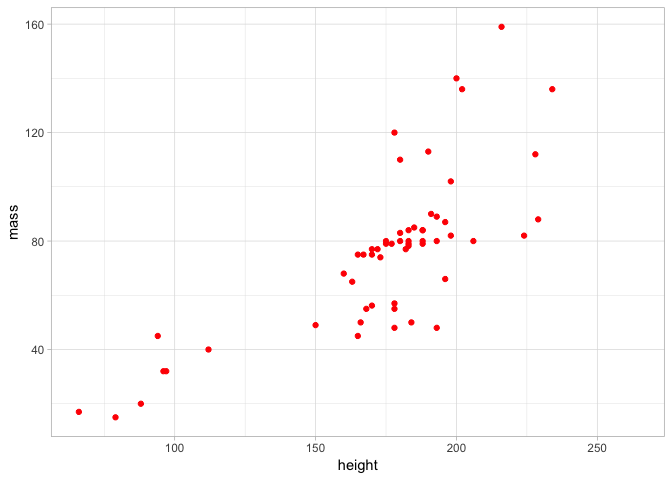
Let’s do a simple scatter plot of the height and mass of the 87 characters in this dataset.
ggplot(starwars, aes(height, mass)) + geom_point()
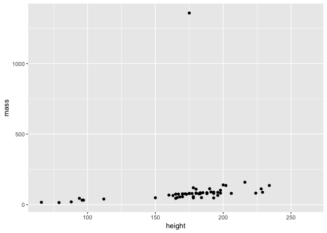
First take a moment to examine the plot - this is actually a brilliant example of why it is important to plot data since you can see that there is one individual with a HUGE mass that distorts our data visualisation. Is this is an error? Or perhaps someone with a lot of mass is in our dataset?
Before we investigate this, it is important to understand how our ggplot2 command is built up:
ggplot()is the function call toggplot2- we provide this with two arguments, firstly we specify our dataset and then next we set an aesthetic- the aesthetic in this case
aes(height, mass)is just what variables to map to the x and y axes - height and mass here - note that this means you just need to provide the variable names - i.e. you don’t need to typestarwars$height - finally we specify a layer for the visualisation itself - in this case we want to plot the data as points on a scatter plot, so we use
geom_point() - note also that we used
+to set up our ggplot function - this is because ggplot allows us to multiple layers of visualisation.
If you have used base graphics before, it can take some time to get used to the ggplot2 way of doing things. However as we walk you through multiple examples here, you will soon get the hang of it and see that it is possible to easily customise plots.
But first, who has such a huge mass?
## # A tibble: 1 x 13
##   name  height  mass hair_color skin_color eye_color birth_year gender
##   <chr>  <int> <dbl> <chr>      <chr>      <chr>          <dbl> <chr>
## 1 Jabb…    175  1358 <NA>       green-tan… orange           600 herma…
## # ... with 5 more variables: homeworld <chr>, species <chr>, films <list>,
## #   vehicles <list>, starships <list>
Well if you’ve seen Star Wars, the answer to this shouldn’t be a huge surprise… Let’s filter him out of the data
starwars2 <- filter(starwars, name != "Jabba Desilijic Tiure")
Now we can replot the data and see what the relationship between height and mass is.
ggplot(starwars2, aes(height, mass)) + geom_point()
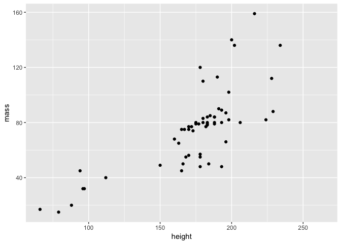
As expected, mass generally increases with height!
Customising a plot
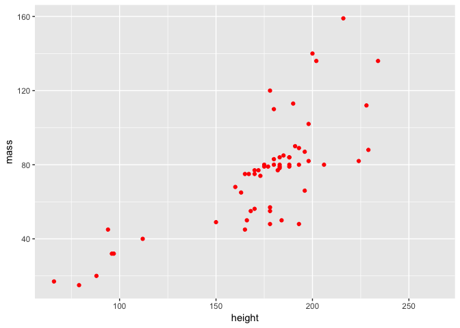
How do we customise our scatter plot using ggplot2? Firstly, we can add some colour to the points.
ggplot(starwars2, aes(height, mass)) + geom_point(colour = "red")
Or we can change their colour and shape.
ggplot(starwars2, aes(height, mass)) + geom_point(colour = "purple", pch = 3)
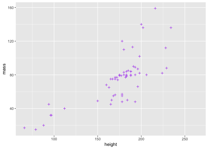
Note that in both of these cases, we added arguments to geom_point - the function that controls the plotting of the points. There is another way to change the point colour, involving the aesthetics, but we will deal with this in a moment.
Perhaps we want to alter the overall theme of the plot? We can do that by adding a theme.
ggplot(starwars2, aes(height, mass)) + geom_point(colour = "red") + theme_light()
By doing this, you can see again how we can build a plot by adding layers using +. It can get messy to do this all with one line, so a nice thing about ggplot2 code is that you can assign it to objects and easily build a complex plot. For example:
a <- ggplot(starwars2, aes(height, mass))
a <- a + geom_point(colour = "red")
a <- a + geom_smooth(method = lm, se = FALSE)
a <- a + theme_light() + ggtitle("Height vs Mass in Star Wars")
a
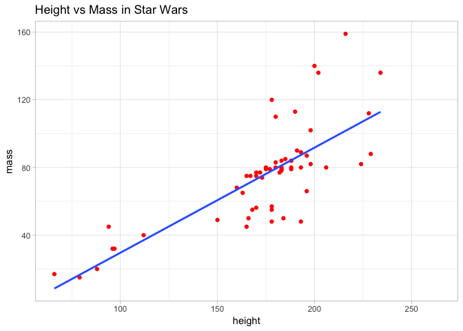
Here we added title and also fitted a line of best fit to the data, to visualise the relationship even more clearly. To achieve this, we used the geom_smooth layer and specified a linear model. This is a topic we will return to in future sessions.
What if instead of just colouring the points to make a plot look nice, we did it to actually try and learn something about the data? For example, we could colour the points by species. This however requires that we map point colour to species in the aes function of our command. We will return to the basic plot and do so below.
ggplot(starwars2, aes(height, mass, colour = species)) + geom_point()
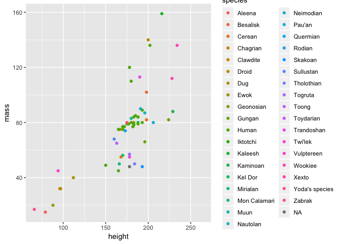
This is where the power of aesthetics starts to become apparent - with ggplot2 it is very easy to map certain variables to an aesthetic and visualise them in a plot.
Different types of plot with ggplot2
There are many different ways to visualise data using ggplot2 beyond the standard scatter plot we have already seen. For a full list with reproducible examples, you should see the ggplot2 manual. However, we will demonstrate a selection here and also get more of an idea of why ggplot2 is so flexible.
Visualising data distributions
First of all, what if we want to look at the distribution of our data? For exampe, we could have looked at the distribution of mass in our dataset and spotted that Jabba was an issue before making our scatter plot. One way to do this would have been to plot a histogram using the geom_histogram layer.
a <- ggplot(starwars, aes(mass))
a + geom_histogram(binwidth = 10)
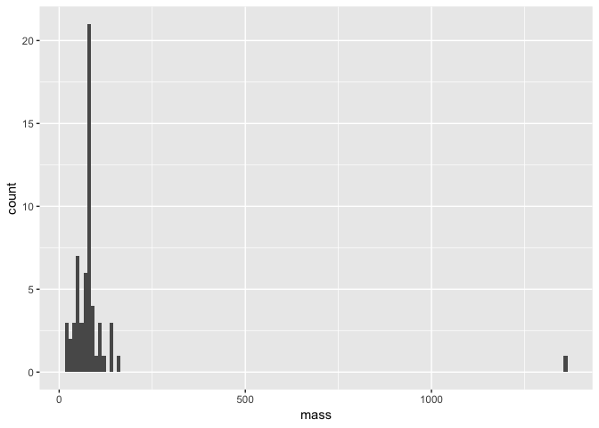
Note that within our geom_histogram layer function, we set the binwidth argument to 10. In other words, we are binning our data by sets of 10. We could for example change this to 100 and see how the distribution changes.
a + geom_histogram(binwidth = 100)
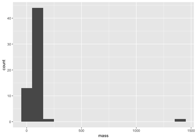
Still though, Jabba is so huge he is an obvious outlier! We also see here that since we definied the basis of our plot as object a with the ggplot and aes functions, all we need to do to replot our histogram is alter the geom_histogram layer.
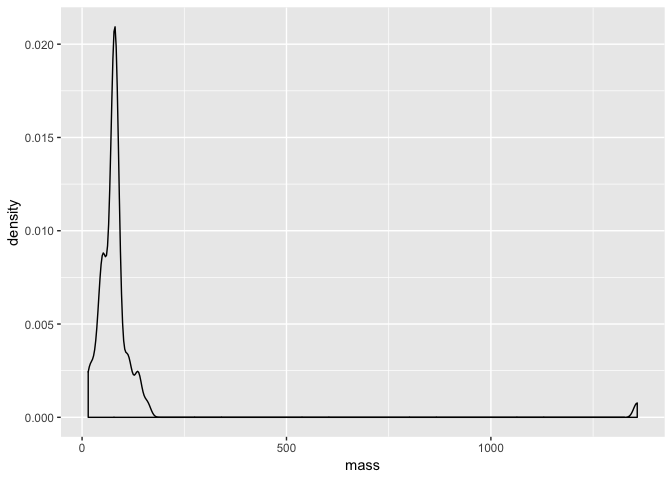
We can in fact completely change the type of plot. Another way to visualise a distribution is to use a smoothed density plot with the geom_density layer. All we need to do is change a small argument in our code.
a + geom_density()
Comparing data distributions
Perhaps we want to compare mass among the different species in our data? One way we can do this is with a boxplot like we did in the introduction to R. ggplot2 makes this exceptionally easy with the geom_boxplot layer.
a <- ggplot(starwars, aes(species, mass))
a + geom_boxplot()
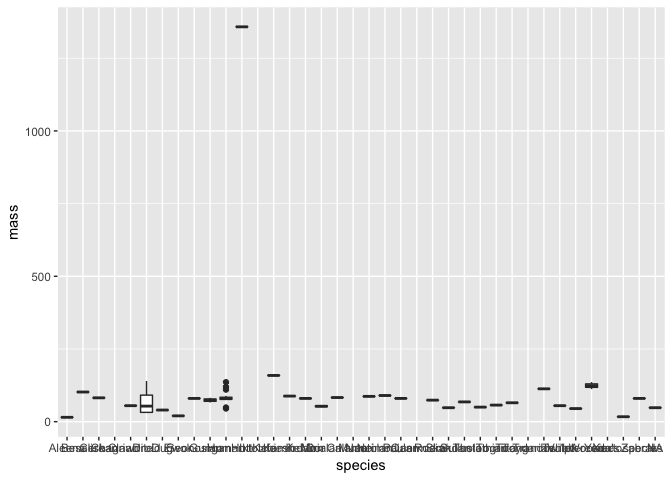
Hmm - although this plot is detailed and we can still see there is a clear outlier, it is difficult to really see much more. This is an important point of data visualisation, you need to think what you hope those viewing the plot can learn from it.
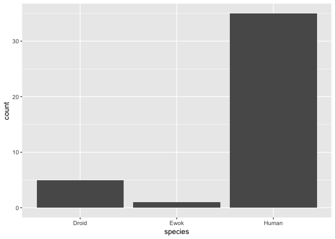
Using the data handling skills we learned earlier in this session, let’s subset our data and visualise it again using geom_boxplot. To get started, we will compare the mass of humans, droids and ewoks.
# subset data
hde <- starwars %>% subset(species == "Human" | species == "Droid" | species == "Ewok")
# plot the distributions
a <- ggplot(hde, aes(species, mass))
a + geom_boxplot()
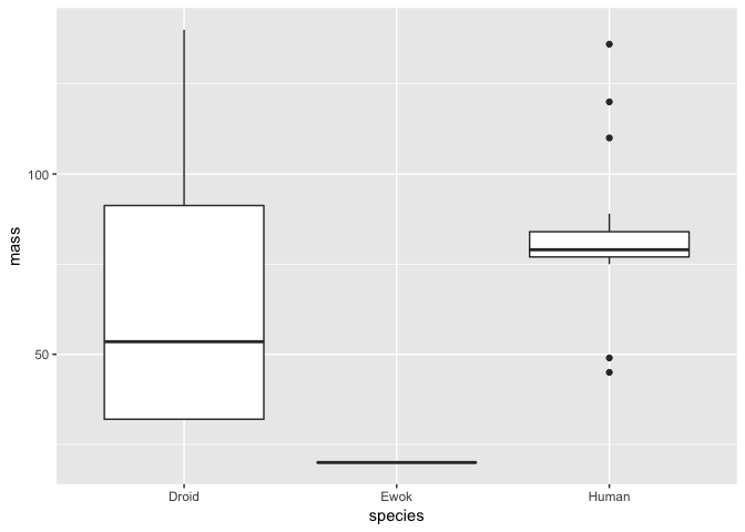
Clearly, Ewoks have a much lower mass than either droids or humans - but note here that there is only a single Ewok observation, so we can’t really compare the distribution of masses among these species.
We can however verify the number of observations for each species. We can do this using dplyr like so:
## # A tibble: 3 x 2
##   species     n
##   <chr>   <int>
## 1 Droid       5
## 2 Ewok        1
## 3 Human      35
We could also visualise this as a barplot with ggplot2. For example:
ggplot(hde, aes(species)) + geom_bar()
More complicated plots and data handling
In some cases, we might want to visualise multiple variables clearly from a dataset. As an example, perhaps we want to look at the difference in both mass and height between humans and droids in a single plot.
Before we do this, let’s subset our data to just include humans and droids - since we know there is only a single Ewok in the data, we can drop it.
hd <- starwars %>% subset(species == "Human" | species == "Droid")
What we would like to do is create a plot with two panels - one for boxplots showing height and the other for boxplots showing mass. We can achieve this with a layer known as facet_grid - however it requires our data to be in a slightly different format - we need to merge both our height and mass measurements into a single column. To do this, we will use a function called gather.
# first we select only the variables we are interested in
hd <- hd %>% select(name, height, mass, species)
hd_g <- hd %>% gather(key = "measurement", value = "value", -name, -species)
hd_g
## # A tibble: 80 x 4
##    name               species measurement value
##    <chr>              <chr>   <chr>       <dbl>
##  1 Luke Skywalker     Human   height        172
##  2 C-3PO              Droid   height        167
##  3 R2-D2              Droid   height         96
##  4 Darth Vader        Human   height        202
##  5 Leia Organa        Human   height        150
##  6 Owen Lars          Human   height        178
##  7 Beru Whitesun lars Human   height        165
##  8 R5-D4              Droid   height         97
##  9 Biggs Darklighter  Human   height        183
## 10 Obi-Wan Kenobi     Human   height        182
## # ... with 70 more rows
What happened here? Within gather we specified our key variable to be measurement - this just creates a character vector with two values, height and mass. We also give our combined variable a name - value here. So now, we have a tibble with twice as many rows as the original but with one for height and one for mass.
We can demonstrate this by actually looking for a single name and seeing there are two rows - one for height and one for mass. For example
filter(hd_g, name == "R2-D2")
## # A tibble: 2 x 4
##   name  species measurement value
##   <chr> <chr>   <chr>       <dbl>
## 1 R2-D2 Droid   height         96
## 2 R2-D2 Droid   mass           32
Use of gather in this way is a bit counterintuitive at first, but with practice you will see it becomes much more straightforward.
So what was the point of this anyway? Well it allows us to construct our plot like this:
a <-  ggplot(hd_g, aes(species, value)) + geom_boxplot()
a + facet_grid(~measurement)
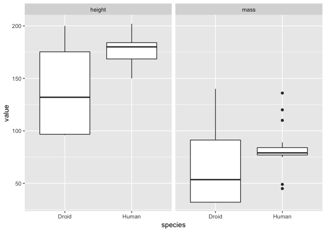
As normal, we specified the data and aesthetics for our plot. However we added the facet_grid argument to split the plot into facets over the different types of measurement (i.e. height and mass here). The ~measurement part of this command just means we should fill the facet grid as new columns. We could also use measurment~. to do the same by rows (note that the . is necessary to allow R to interpret the command properly). Like so:
a + facet_grid(measurement~.)
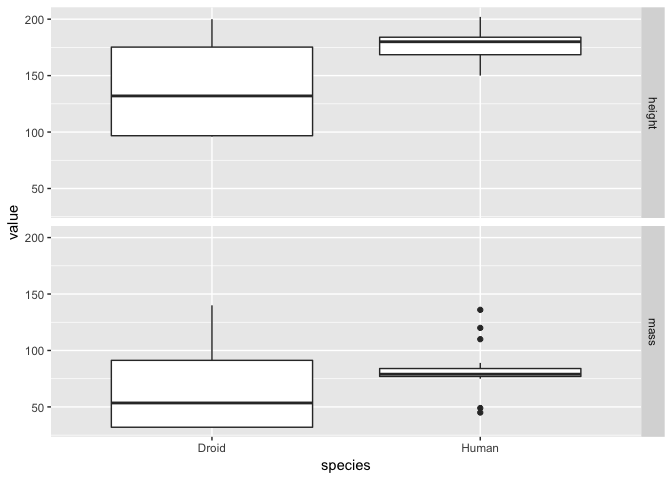
It is a matter of opinion, but the we think that the first plot looks better! Either way, from both plots it is clear that the humans are on average taller than droids but that there is much greater variation in both droid mass and height!
Annotating and making publication quality plots
The concept of layers in ggplot2 is similar in ethos to that used in graphic design programs such as Adobe Illustrator or Photoshop. You create a plot and you can add layers of detail to it. This makes it very straightforward to create a publication quality figure with a few lines of code.
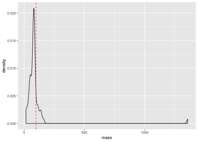
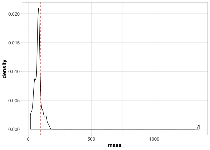
Let’s return to our earlier density plot of mass from our starwars data.
a <- ggplot(starwars, aes(mass))
a <- a + geom_density(binwidth = 10)
a

With the code above, we have commpletely assigned our plot to the object a. So now all we need to do is add layers to it to annotate it.
First of all, let’s plot mean value of mass as a vertical line on the plot. To do this we need to calculate the mean, which we would do like so:
mean_mass <- mean(starwars$mass, na.rm = T)
mean_mass
We need the na.rm = T argument here because some individuals do not have a measured mass (i.e. they are NA) - without this, a call to the mean will only produce an NA. Anyway, now that we have defined our mean mass, we can add it to our plot as a line like so.
a <- a + geom_vline(xintercept = mean_mass, lty = 2, colour = "red")
a
Next we can add some theme arguments to make our plot suitable for publication.
a <- a + theme_light()
a <- a + theme(axis.title = element_text(size = 13, face = "bold"),
               axis.text = element_text(size = 11))
a
Note that here we have to call theme_light() first or it will override all the other arguments we made to theme() later.
There is a huge amount you can do to make plots look more aesthetically pleasing - you should check out all the options available in the ggplot2 manual.
Finally, once you have created a plot you like, you might want to save it. You can do this easily using the ggsave.
ggsave("./myplot.pdf", plot = last_plot(), device = "pdf")
Here we saved a plot to the current directory (use getwd() if you need to find out where this is) as pdf caled myplot.pdf.
Some last words on ggplot2
Hopefully the last section has convinced you that ggplot2 is a versatile and flexible tool for data visualisation. There are many more things that are possible with the package but unfortunately, we do not have the time or space to go into them all here. Nonetheless, ggplot2 will be used throughout the remainder of our R sections, so when new topics or concepts arise, we will do our best to explain them.
However, if you are keen to learn more about ggplot2, we highly recommend the R Graphics Cookbook as an entry level tutorial.
Making use of R scripts
As you’ve progressed through the introductory session and a slightly more advanced look at handling data in R, you’ve no doubt gotten a little fed up with repeatedly typing out command line instructions for R. You might be (quite rightly) thinking to yourself that there must be a better way to do this? Surely it isn’t necessary to write long commands each time?
Well, there is a much better way - you can write a script. Scripts are used in R and many other programming languages as a means of saving your code and recording what it is you have done. They are arguably one of the most essential aspects of programming and bioinformatics. Indeed, a properly written script can be used in a similar manner to a standalone program. You simply plug in your data, run the script and let it output your analysis.
So you might ask, if scripts are so important, why on earth didn’t we teach you about them right at the start of all of this!? Well, firstly we wanted to delve right into R and show you what is possible. Also repeatedly typing out commands can be a good way to learn the basics. Most of all though, it should be around this point in the tutorial that you realise the value of using a script. You have learned to create more and more complex data structures, visualise and plot this data and also to apply some basic functions.
It might be helpful to think of a script as a step-by-step guide of what you are doing in your analysis. This is actually how we primarily use them in R when doing an analysis for the first time. Typically we would work with an open script document and then type our commands into it, editing it along the way. The idea is that when we reopen the script again in a few days time, we can use it to keep track of our progress and reperform our analysis.
There are no strict rules for writing a script - different people have different styles. We will teach you ours but be aware there are many different opinions out there. Because of the diversity in script writing, we will not try and enforce a specific practice here. However, we strongly suggest one important rule that you should try your best to follow - keep your scripts clear and self-explanatory. We cannot tell you the amount of time we have wasted opening old scripts (of our own!) after some time away from an analysis that are completely incomprehensible. We might have written them, but understanding them is like decoding the Voynich Manuscript or some ancient lost language.
It is much, much more satisfying and time efficient when you write a script that you can reuse easily, quickly and without effort. Perhaps a colleague updates your dataset or a reviewer asks you to reperform an analysis - with a carefully written script you can redo that analysis quickly and with minimum fuss.
Where to write scripts
If you’ve worked this far through the tutorial, you might have already been keeping snippets of code in a text file. If so, this is a basic form of scripting. R scripts are essentially text files but they have the .R extension. This means that if you use a text editor (i.e. external to RStudio) you can write a script, all you need to do is save it with the .R extension. Some editors such as Atom and TextWrangler will also have syntax highlighting for R scripts - i.e. they colour the script to show objects, functions and so on.
To make things more straightforward here and to take advantage of some useful R specific features, we will use the script editor in Rstudio. To open up a script, you can go to the header menu and select File > New File > R Script. This will open up a blank window in the Rstudio console - this is an inbuilt text-editor for you to write your script in.
Let’s write an R command into our script and then run it in the console to demonstrate how a script works. Try the following:
seq(1, 1000, 1)
Now, with your R script open, you can place your cursor on the line here hit Cmd + Enter (Mac) or Ctrl + Enter (PC). This will run your R command in the console and you should see that you generated a vector of numbers from your script. Simple! You’ll also notice the syntax highlighting here - the numbers within the seq command should be a different colour, indicating they are numeric variables.
Some useful scripting tips
A good general structure for an R script is to start with a single command to clear the R environment and prevent any conflict with existing packages or named objects. We usually start all our R scripts with:
rm(list = ls())
This will remove everything in your environment - i.e. objects, data etc. However packages will remain loaded.
Next we might have a section of the script for loading packages. This essentially initiates our script and lets us know how we are setting up the working environment.
library(tidyverse)
library(MASS)
We might then read in some data (or access it from the environment) and perform our analyses. In the next section, we will write a small demo script together but before we do so, it is important to introduce you to comments. You can add comments to an R script by prefacing your code with a #. This basically allows you to write text that will not be interpreted by the R console. For example
# generate a vector of numbers
seq(1, 1000, 1)
Here we can use comments to essentially annotate our code. This is an extremely useful feature that makes it much much easier to read and interpret a script. After all, as proficient in R as you might become, it is not exactly the sort of language you can just read easily. Comments are what will help you navigate your analyses and help you remember why you did what you did. A good rule of thumb for writing comments is to imagine you are trying to annotate the script for someone else to use. This is actually a pretty good thing to aim for, since once you become adept at scripting and R coding, you may well need to write scripts for others who ask for your help! Good comments will help them navigate the script too and make your life a lot easier.
A simple script example
Now that we have an idea of how scripting works, we can try writing a simple script together. The following code is a very short example of how we might combine some of the things we have learned in this tutorial into a single script that makes it clear what we are doing with our analyses and data manipulation. We’ll return to the Star Wars data and plot the height and mass relationship we did previously.
### A simple R script to filter and plot the star wars data ###
rm(list = ls())

# load packages
library(tidyverse)

# load the star wars data
data(starwars)

# remove Jabba
starwars2 <- filter(starwars, name != "Jabba Desilijic Tiure")

# create a height/mass scatterplot
a <- ggplot(starwars2, aes(height, mass))
a <- a + geom_point(colour = "red")
a <- a + geom_smooth(method = lm, se = FALSE)
a <- a + theme_light() + ggtitle("Height vs Mass in Star Wars")
a

# write out the plot as a pdf
ggsave("./starwars_height_mass.pdf", plot = last_plot(), device = "pdf")
So all we did here is:
- set up our R environment
- read in and manipulated our data
- created our plot
- wrote our plot to an output
If we wanted to repeat this analysis again, all we need to do is run the script. We can change things like the data we read in but this script provides a good general template for how we might start to make a standalone analysis script that we can reuse for different purposes. It’s important to keep in mind that this is only the basics of scripting. It is possible to make R scripts that are actually stand alone programs that you can run from the command line for example. However, from now on you should try following the tutorials by making your own scripts alongside them.
Going further
As normal, R has a huge range of freely available resources online that can help you learn more about data manipulation, the tidyverse, ggplot2 and scripting. Here we point you to a few below that you might be interested in.
- Datacamp has an free introduction to using tidyverse packages to manipulate data
- Hadley Wickham & Garrett Grolemund have written the definitive, freely available online book on using R for data manipulation - this is the ‘bible’ of the tidyverse approach and includes a section on ggplot2
- There is also a Datacamp course on ggpot2
- Winston Chang’s R Graphic’s Cookbook is also an excellent resource for using ggplot2 for data visualisation
- A detailed software carpentry guide to R scripting