Population structure: PCA
Now that we have a fully filtered VCF, we can start do some cool analyses with it. First of all we will investigate population structure using principal components analysis. Examining population structure can give us a great deal of insight into the history and origin of populations. Model-free methods for examining population structure and ancestry, such as principal components analysis are extremely popular in population genomic research. This is because it is typically simple to apply and relatively easy to interpret.
Essentially, PCA aims to identify the main axes of variation in a dataset with each axis being independent of the next (i.e. there should be no correlation between them). The first component summarizes the major axis variation and the second the next largest and so on, until cumulatively all the available variation is explained. In the context of genetic data, PCA summarizes the major axes of variation in allele frequencies and then produces the coordinates of individuals along these axes.
To perform a PCA on our cichlids data, we will use plink - specifically version 1.9 (although be aware older and newer versions are available). Note that plink was originally written with human data in mind and has also subsequently been extended to include some model species. As a result, we need to provide a bit of extra info to get it to work on our dataset.
Linkage pruning
One of the major assumptions of PCA is that the data we use is indpendent - i.e. there are no spurious correlations among the measured variables. This is obviously not the case for most genomic data as allele frequencies are correlated due to physical linkage and linkage disequilibrium. So as a first step, we need to prune our dataset of variants that are in linkage.
First things first, we will make a directory called plink
# move to your home directory
cd ~
# make a plink directory
mkdir plink
# move into it
cd plink
We will also simplify our code using some environmental variables. Primarily we set one for our filtered VCF.
VCF=~/vcf/cichlid_full_filtered_rename.vcf.gz
This will make it very easy for plink to read in our data. Next we run the linkage pruning. Run the command and we will breakdown what all the arguments mean.
# perform linkage pruning - i.e. identify prune sites
plink --vcf $VCF --double-id --allow-extra-chr \
--set-missing-var-ids @:# \
--indep-pairwise 50 10 0.1 --out cichlids
So for our plink command, we did the following:
--vcf- specified the location of our VCF file.--double-id- toldplinkto duplicate the id of our samples (this is because plink typically expects a family and individual id - i.e. for pedigree data - this is not necessary for us.--allow-extra-chr- allow additional chromosomes beyond the human chromosome set. This is necessary as otherwise plink expects chromosomes 1-22 and the human X chromosome.--set-missing-var-ids- also necessary to set a variant ID for our SNPs. Human and model organisms often have annotated SNP names and soplinkwill look for these. We do not have them so instead we set ours to default tochromosome:positionwhich can be achieved inplinkby setting the option@:#- see here for more info.--indep-pairwise- finally we are actually on the command that performs our linkage pruning! The first argument,50denotes we have set a window of 50 Kb. The second argument,10is our window step size - meaning we move 10 bp each time we calculate linkage. Finally, we set an r2 threshold - i.e. the threshold of linkage we are willing to tolerate. Here we prune any variables that show an r2 of greater than 0.1.--outProduce the prefix for the output data.
As well as being versatile, plink is very fast. It will quickly produce a linkage analysis for all our data and write plenty of information to the screen. When complete, it will write out two files cichlids.prune.in and cichlids.prune.out. The first of these is a list of sites which fell below our linkage threshold - i.e. those we should retain. The other file is the opposite of this. In the next step, we will produce a PCA from these linkage-pruned sites.
Perform a PCA
Next we rerun plink with a few additional arguments to get it to conduct a PCA. We will run the command and then break it down as it is running.
# prune and create pca
plink --vcf $VCF --double-id --allow-extra-chr --set-missing-var-ids @:# \
--extract cichlids.prune.in \
--make-bed --pca --out cichlids
This is very similar to our previous command. What did we do here?
--extract- this just letsplinkknow we want to extract only these positions from our VCF - in other words, the analysis will only be conducted on these.--make-bed- this is necessary to write out some additional files for another type of population structure analysis - a model based approach withadmixture.--pca- fairly self explanatory, this tellsplinkto calculate a principal components analysis.
Once the command is run, we will see a series of new files. We will break these down too:
PCA output:
cichlids.eigenval- the eigenvalues from our analysiscichlids.eigenvec- the eigenvectors from our analysis
plink binary output
cichlids.bed- the cichlids bed file - this is a binary file necessary for admixture analysis. It is essentially the genotypes of the pruned dataset recoded as 1s and 0s.cichlids.bim- a map file (i.e. information file) of the variants contained in the bed file.cichlids.fam- a map file for the individuals contained in the bed file.
Plotting the PCA output
Next we turn to R to plot the analysis we have produced!
Setting up the R environment
First load the tidyverse package and ensure you have moved the plink output into the working directory you are operating in. You may want to set up an RStudio Project to manage this analysis. See here for a guide on how to do this.
# load tidyverse package
library(tidyverse)
Then we will use a combination of readr and the standard scan function to read in the data.
# read in data
pca <- read_table2("./cichlids.eigenvec", col_names = FALSE)
eigenval <- scan("./cichlids.eigenval")
Cleaning up the data
Unfortunately, we need to do a bit of legwork to get our data into reasonable shape. First we will remove a nuisance column (plink outputs the individual ID twice). We will also give our pca data.frame proper column names.
# sort out the pca data
# remove nuisance column
pca <- pca[,-1]
# set names
names(pca)[1] <- "ind"
names(pca)[2:ncol(pca)] <- paste0("PC", 1:(ncol(pca)-1))
Next we can add a species, location and if required, a species x location vector. We will do this using the R version of grep. We then use paste0 to combine the columns.
# sort out the individual species and pops
# spp
spp <- rep(NA, length(pca$ind))
spp[grep("PunPund", pca$ind)] <- "pundamilia"
spp[grep("PunNyer", pca$ind)] <- "nyererei"
# location
loc <- rep(NA, length(pca$ind))
loc[grep("Mak", pca$ind)] <- "makobe"
loc[grep("Pyt", pca$ind)] <- "python"
# combine - if you want to plot each in different colours
spp_loc <- paste0(spp, "_", loc)
With these variables created, we can remake our data.frame like so. Note the use of as.tibble to ensure that we make a tibble for easy summaries etc.
# remake data.frame
pca <- as.tibble(data.frame(pca, spp, loc, spp_loc))
Plotting the data
Now that we have done our housekeeping, we have everything in place to actually visualise the data properly. First we will plot the eigenvalues. It is quite straightforward to translate these into percentage variance explained (although note, you could just plot these raw if you wished).
# first convert to percentage variance explained
pve <- data.frame(PC = 1:16, pve = eigenval/sum(eigenval)*100)
With that done, it is very simple to create a bar plot showing the percentage of variance each principal component explains.
# make plot
a <- ggplot(pve, aes(PC, pve)) + geom_bar(stat = "identity")
a + ylab("Percentage variance explained") + theme_light()
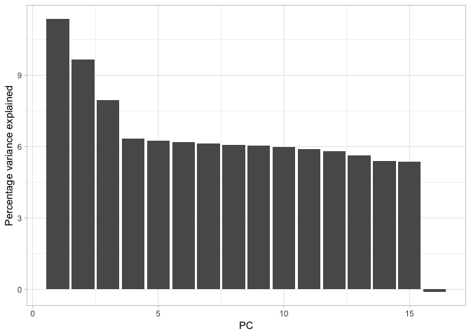
Cumulatively, they explain 100% of the variance but PC1, PC2 and possible PC3 together explain about 30% of the variance. We could calculate this with the cumsum function, like so:
# calculate the cumulative sum of the percentage variance explained
cumsum(pve$pve)
Next we move on to actually plotting our PCA. Given the work we did earlier to get our data into shape, this doesn’t take much effort at all.
# plot pca
b <- ggplot(pca, aes(PC1, PC2, col = spp, shape = loc)) + geom_point(size = 3)
b <- b + scale_colour_manual(values = c("red", "blue"))
b <- b + coord_equal() + theme_light()
b + xlab(paste0("PC1 (", signif(pve$pve[1], 3), "%)")) + ylab(paste0("PC2 (", signif(pve$pve[2], 3), "%)"))
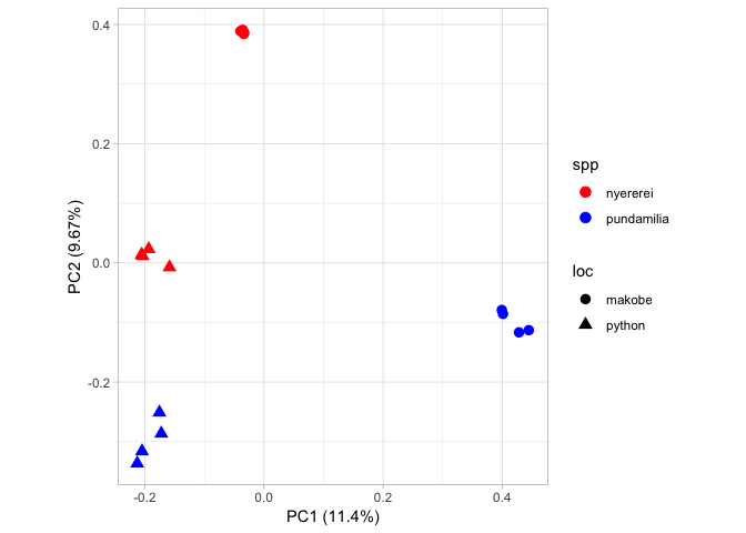
Note that this R code block also includes arguments to display the percentage of variance explained on each axis. Here we only plot PC1 and PC2. From this figure, we can see PC1 separates out the geographical locations and PC2 separates out the species.